Zipdrug by Anthem Inc. - Design System
As part of being newly acquired by Anthem Inc., Zipdrug is looking to re-design its visual identity, focusing on patterns in the UI to create components and a style guide.
The style guide focuses on typography, colors, icons, and examples of components, while the component sheets explain the layout, spacing, properties, states, and anatomy of a component.
From these initial foundation steps, the design team can continue to scale and implement new components to the design system through continuous product auditing.
Role: Founding product designerCOmpany: Zipdrug by Anthem Inc.Duration: Jun 2020 - Nov 2020
Design System Redesign
Zipdrug needed a Design System restructure and re-design that could help save time and resources by eliminating the need to create every design element from scratch.
The Design System should promote accessibility by providing guidelines for creating designs that are inclusive and usable for all users.
Phase 1: Research
User research
Visual styles
Component design
Phase 2: Design & Documentation
Visual styles
Accessibility test
Component iterations
Final documentation
Key Painpoints
Inconsistency throughout the process made it difficult for users to understand and navigate, which led to frustration and confusion and, therefore to a negative user experience
Poor Usability led to a state where the system was unintuitive and hard to use, which made it difficult for its user to accomplish their objectives
The system had a limited scalability making it hard to scale effectively as the organisation was growing
A poorly designed system that led to increased costs and this making developers spend more time working around limitations and inconsistencies
Decreased brand value that was originated by the bad system. Users expressed they feel it is unsafe to use the software because the interface changes from page to page.
Re-brand Solutions
Established a basic overarching brand visual identity for Zipdrug, as well as components that will be used throughout the software
Established a visual language
Establish a system that prioritizes usability through a user-centric accessible design system. Users will have less cognitive load as an improvement to the redesign
Create branding guidelines
Utilize Brad Frost’s Atomic Design Methodology to create atoms, molecules, organisms, templates, and page systems working together as a holistic design system
Implement scalable design
An exploration in visual style and implementation based on industries such as healthcare and cloud services.
Visual Research
A list of inventory for the design patterns to be build is created to help the team keep track of coimponents to be deiged for Design System Verion 1.
Define the system
Color
Color themes are designed to be harmonious, ensure accessible text, and distinguish UI elements and surfaces from one another.
Typography
Powered by Google Fonts, the typographic consists of Roboto family ( Roboto SemiBold, Roboto Medium, and Roboto Regular) to provide a wide range as well as create cohesiveness.
Grids
Layouts are to help uniform elements and spacing to encourage consistency across platforms, environments, and screen sizes.
Components
Components are interactive building blocks for creating a user interface. Components library can included data tables, navigations, checklists, and more.
Testing the system
Accessibility
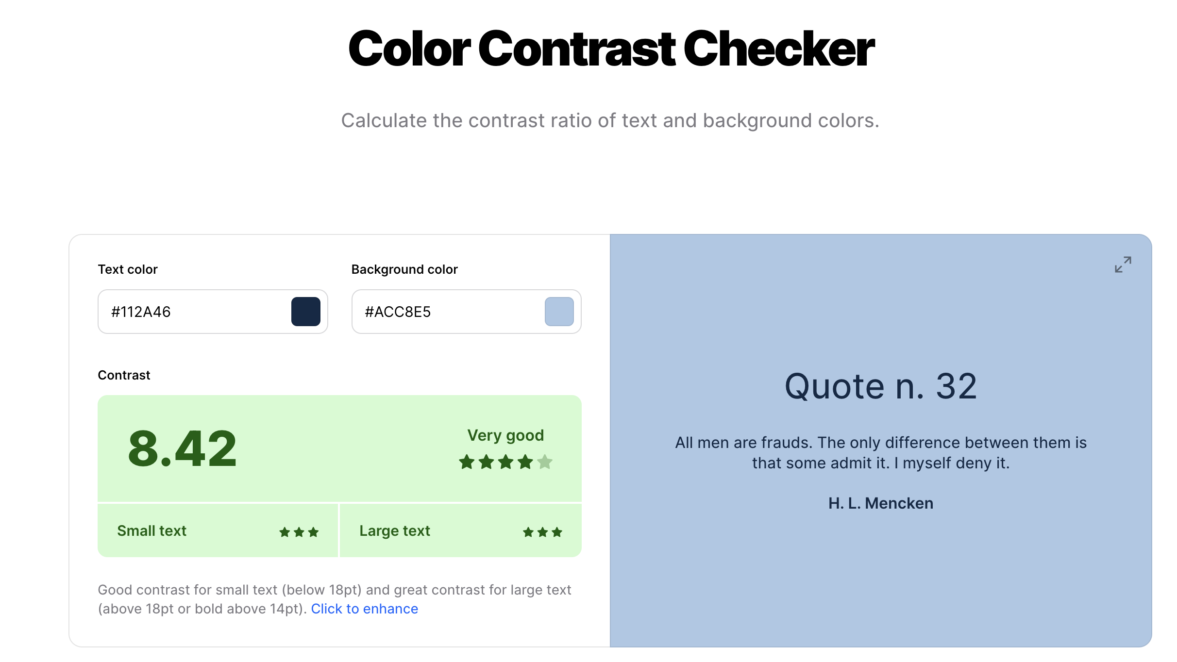
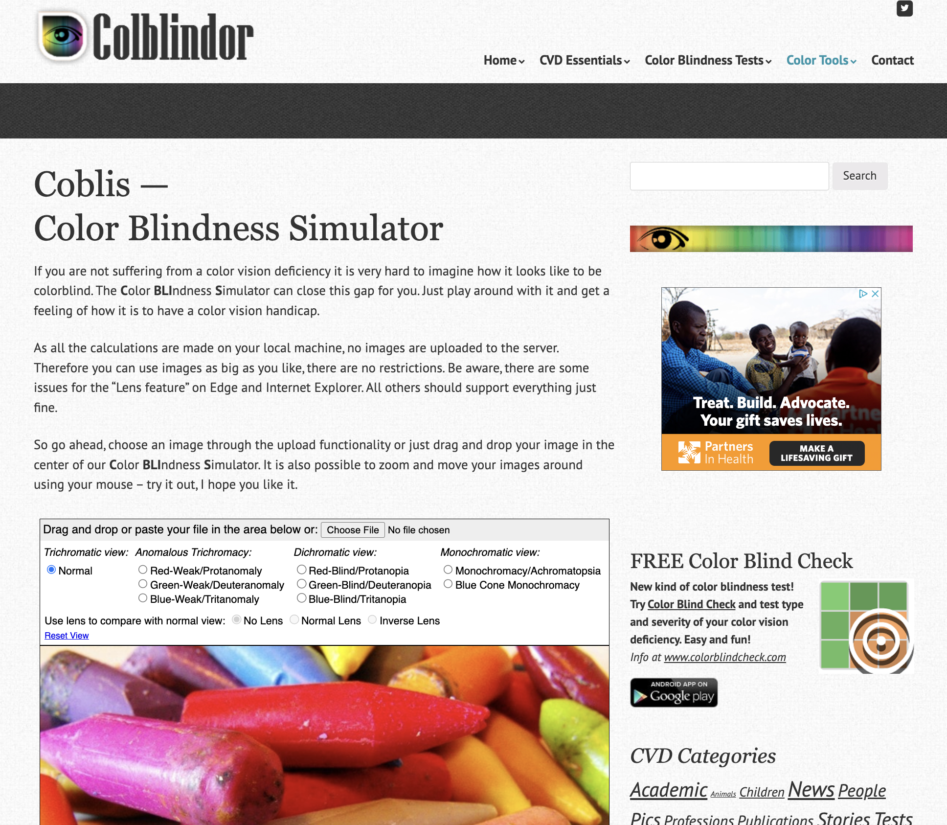
Designing with accessibility in mind to ensure the product is inclusive for visual and cognitive disabilities using sites as Coblis —Color Blindness Simulator and Coolors Contrast Checker
Usability
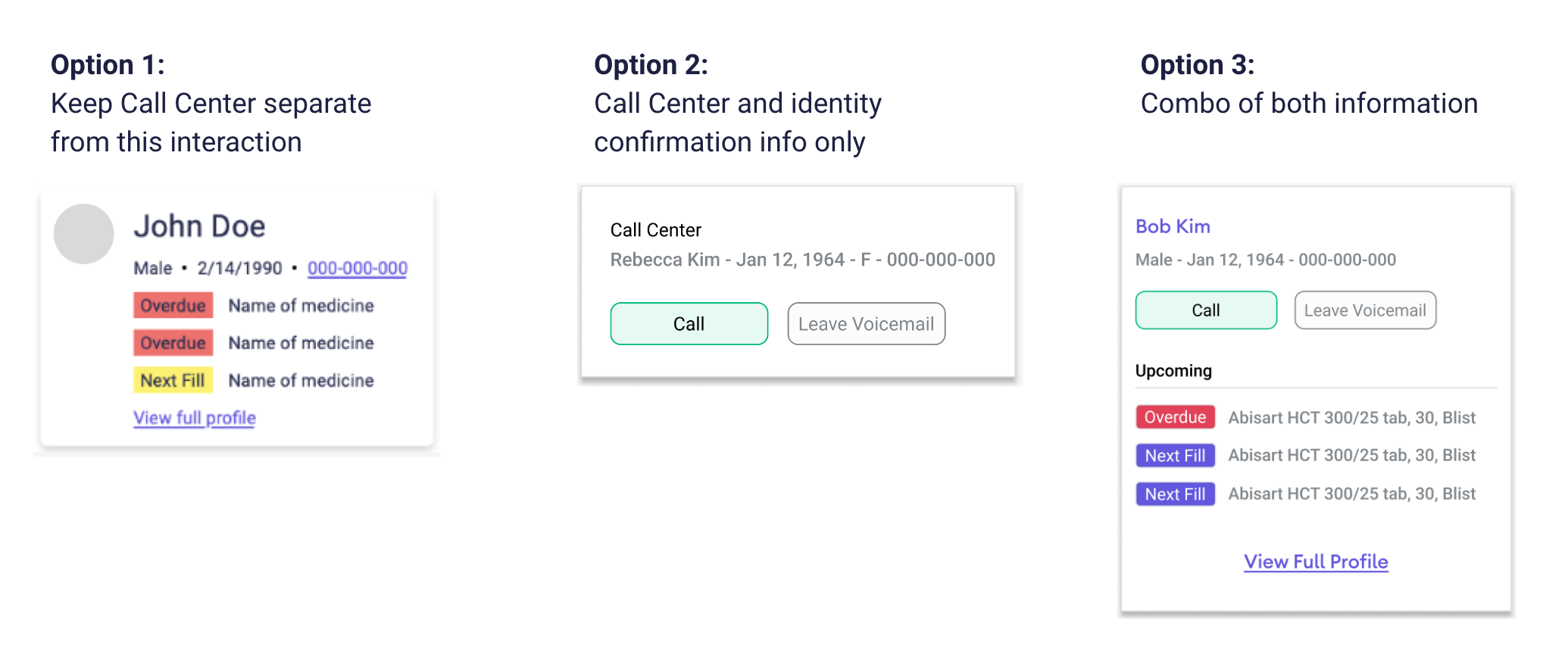
Variation of components are tested in context of the layout to ensure component design is harmonious and the component works as a whole in the system
Documentation
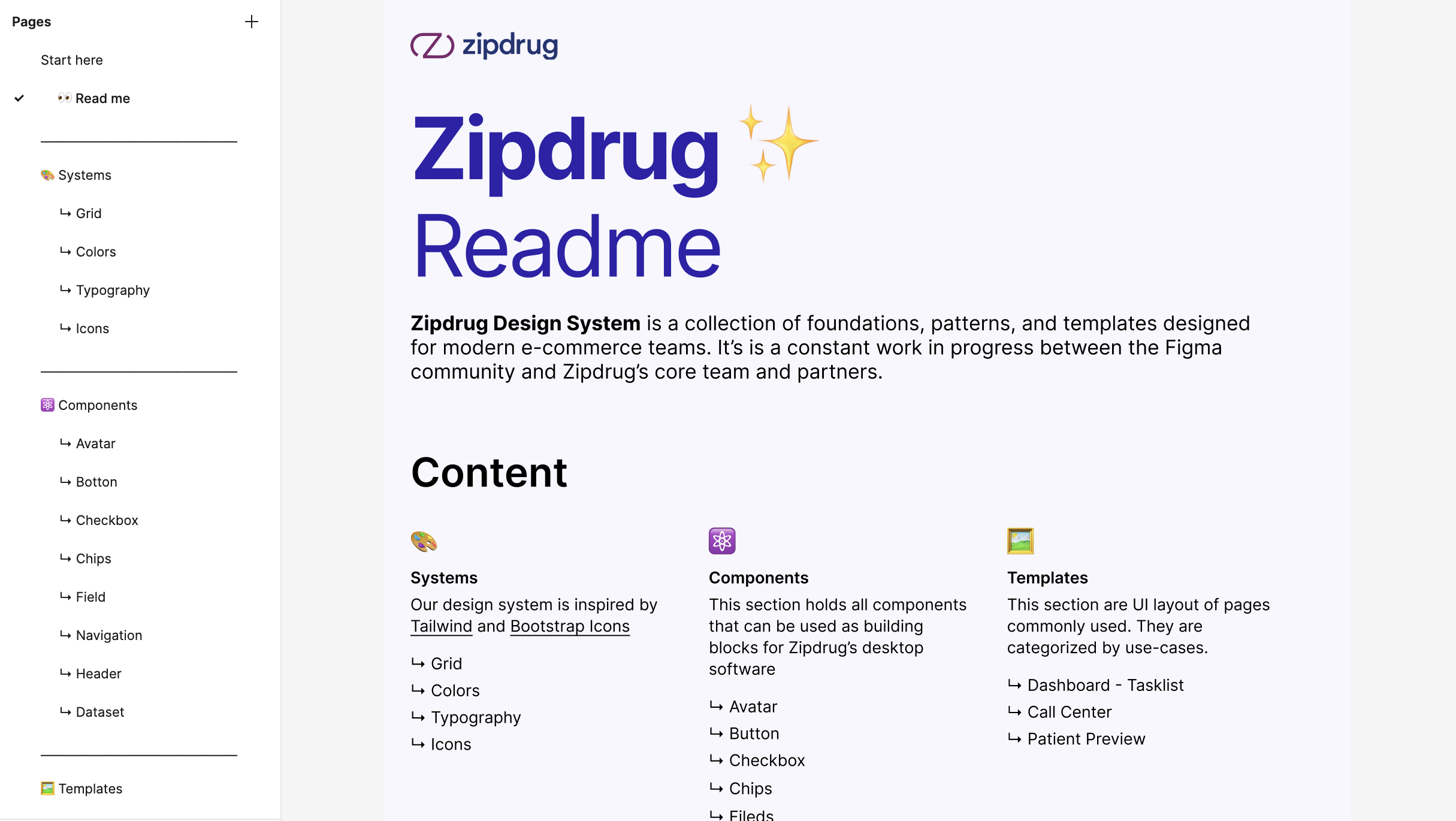
A Design system is created on Figma with a collection of reusable components and clear standards that can be assembled together to build any number of applications. The design systems aid in digital product design and development of products such as mobile applications or websites
Please follow the link for the Figma file

