American Express - Hilton Honors Co-Brand
Hilton co-brand with American Express for a series of business and personal cards that includes hotel rewards programs, points for free stays, and points for exclusive experiences.
Role: Lead UX Designer Agency: Dentsu mcgarrybowenDuration: Jul 2019 - Jan 2020
Challenge
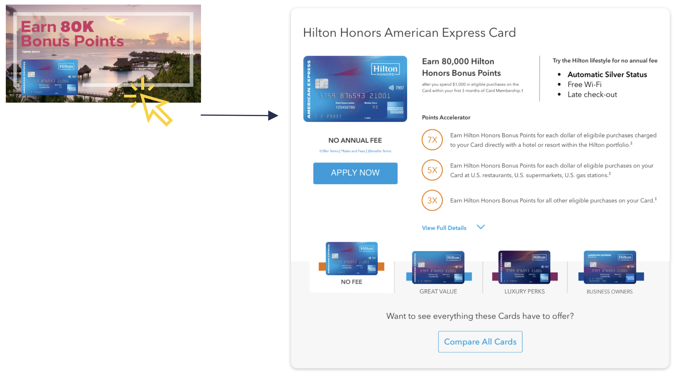
There are 4 types of Hilton Honor card products. When users land on the experience, they enter this page through targeted click-ads. Their expectation is to continue to a card-specific marketing page.
However, the page is static, showing all 4 cards with the same level of visual importance. This makes the user work harder for necessary information and breaks the individualized experience. As a result, the page is seeing an 81% bounce rate.
Problems to tackle
The site doesn’t cater to users in different stages in the conversion funnel
Users do not understand how points convert to rewards
Physical card looks very similar which makes it difficult to differentiate on the website
Card names are long, confusing, and don't differentiate each card
The website uses jargon and industry-specific language which is difficult for an average user to understand
There is no highlighted value between personal and business cards
2020 live siteGoals and Metrics
Drive conversion
Track success metrics towards increased number of users applying for the Hilton Honors card
Individualize experience
Design a tailored experience for a range of users landing on the site in different phases of the conversion funnel
Lacks product clarity
Provide more descriptive content to help match the best cards for different types of users
Missing information
Make a clear differentiation between each card and highlight their benefits
Missing value prop
Get users engaged and excited about the benefits of Hilton Honors
Brand represention
Design a visual language middle ground to represent both the Hilton and American Express brand
Part 1: Quantitative Research
User flow in the conversion funnel
The majority of traffic for this page is from users clicking on targeted ads. The ads display a specific card that the user has been researching. When a user clicks on the ad, they enter the AMEX x Hilton Honors landing page. The page has general information of all 4 cards above the fold, this breaks the individualized card experience that the user was previously on. This page has seen high bounce rate and low conversion.
Data Findings
Average Time On Page
The average time spent on this page is 4 minutes. This is longer than the average consideration time compared to other AMEX financial products. Assumptions: users are confused and trying to figure out what they are looking at
Bounce Rate
The majority of visitors enter by clicking on a targeted ad.
Data shows an 81% bounce rate for this page. Key assumptions are that users are not finding what they are looking for, or need more information before making a decision
Conversion
Users convert the Hilton Honors American Express Card and Hilton Honors American Express Surpass® Card
Very few convert with the Hilton Honors American Express Aspire Card and Hilton Honors American Express Business Card
Heatmaps
The heatmap shows users are interacting throughout the page and scrolling to the bottom. They may not find the information they are looking for or none of the card products fit their needs which result in visitor leaving the page
Users click the card image
Users click the info icon under Built-in travel benefits
Less users convert at the bottom than at the top of the page
Users click on logos at the footer
Part 2: Qualitative Research
Understanding target audience
Ten 90-minute focus group tests and interviews were conducted to identify marketing messages that resonate with users and overlapping patterns of current cardholders and prospective customers
To better communicate with users in the page redesign, we looked at what type of travel spoke to current cardholders and future prospects. This allows us to gear the imagery, and language, and highlight key benefits that speak to users.
Testing out language and imagery
👩🔬 Test Goal: Gauging participant’s appetite with “Adventure” through “Wildly Familiar”, “Redefining Vacation”, and points ads
Wildly Familiar
Most preferred Wildly Familiar
Participants liked the way it conveyed a combination of fun and luxury
It was perceived as more young, modern, upscale, and aspirational
It refreshed the way participants thought about Hilton - more modern and luxurious
Redefining Vacation
It felt less relatable
It was perceived as immature (vs. the elevated feel of Wildly Familiar)
They didn’t understand the meaning of the drawings
They didn’t like the look of the drawings and felt they didn’t fit with their upscale impressions of Hilton and American Express
Points based
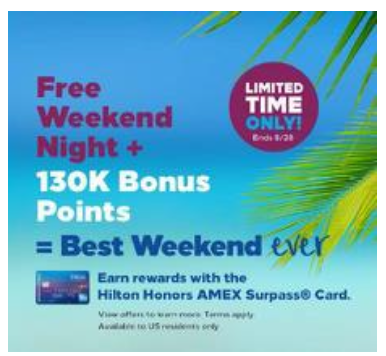
While they would want to look into the offers further, the numbers got participants’ initial attention
Participants also want to understand the benefits better (e.g., what are 130,000 points worth? What does Gold status include?)
Findings
Overall, participants booking Hilton Hotel are risk averse and like to know what they are getting into. In travel, they prefer tame experiences as opposed to extreme “adventure”. Participants expressed that they like staying at the Hilton because of the consistency, convenience, and luxury.
Participants identified with the “adventure/comfort” platform overall
While “adventure” may seem too extreme in some cases, virtually everyone could identify with the idea of exploration or new experiences
They like adventure, but not TOO much adventure
Participants really enjoy comfort and luxury
Most identified with the idea of coming back to comfort they could rely on after a day of travel
At a minimum, they want comfort and cleanliness
Many are looking for much more from a hotel, including very comfortable beds and pillows, happy hour, on-property restaurant, room service, pool, and spa services
Personas
Aligning cards to different personas and user needs
Part 3: Redesign
Key Design Pillars
Flexible Modules
Implementing a dynamic page to cater to the user's individual journey. Modules on the page can be rearranged based on which ad users are clicking to land on the page. This helps continue a seamless narrative for the user journey
Implementing an Dynamic landing page
The benefit of Atomic Design is that modules can be flexible. Items within modules can be hidden or shown to provide a better individualized experience
Engaging users with interactive modules
This page should get users excited and engaged about Hilton Honors points, benefits, and values
Content Hierarchy
Continuing User Journey
The “At A Glance” module adjusts according to the ad the user clicks on to land on the page. If the ad speaks about “Earn 80,000 points”, this module will show the Hilton Honors x American Express Card.
Users can toggle between other card products, View Full Details (for bottom-funnel users), and Compare All Cards
Guided Quiz
A quiz can help make recommendations for Top-Funnel users who are early in their research and unsure what product fits their lifestyle
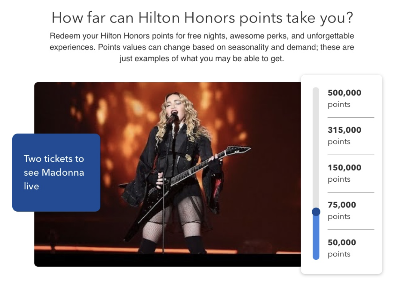
Point Slider
The focus group shows many participants are unsure of what they are getting out of the points program. Most participants just go for the biggest number. This module can help users connect Hilton Honors points to rewards to free stay, rewards, and experiences
Wireframes
Translating strategy into design
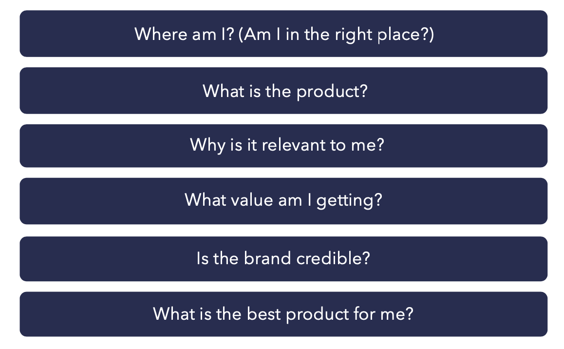
Users are landing on the page at different stages of the conversion funnel, the site needs to answer questions for both users in the top-funnel as well as middle funnel
Content Hierarchy
Flexible Modules Wireframe
The content on this page will rearranged based on how the user enters the site. The author of the targeted ad can determine if the ad will navigate to Top Funnel, Middle Funnel, or Bottom Funnel page layout
Top-funnel and Middle-funnel
This is catered towards users who need more guidance in finding a card, they are starting their card search and are not familiar with Hilton Honors and are sure which card is right for them. Users have been researching content Content is organized with more information leading into the card products.
Bottom-funnel
This is catered towards users who have done their research and are ready for conversion. This design prioritizes the cards the user has been on a journey exploring.
Final Design
Combining Designing System from AMEX and Hilton, our team found a harmonious approach in combining the two brand identity


