American Express
Accounts Payable landing page redesign
American Express was looking to redesign the Accounts Payable landing page with the goal of making the experience self-guided and more informative.
Role: Senior UX DesignerAgency: Dentsu McGarryBowenDuration: Jul 2019 - Jan 2020
The Challenge
Users has difficulties understanding the differences between business size based product offering. As a result, potential customers are filling out the wrong form and ended up being rejected or leaving the page without enrollment
Goals
Improve conversion measured through online enrollment
Clear definition of products business size criteria
Improve overall user experience
Key focus areas for redesign
The page doesn't key highlight values users are looking for in an Accounts Payable program
Missing value prop
The page shares an endpoint for multiple journeys. Small businesses have a separate experience from a medium or large business
Shared landing page
There is no clear differentiation for the conversion / sign-up process (talking to a specialist are only for medium and large business while VendorPay are for small business)
Lacks clear pathways
Users does not understand what the Accounts Payable products are
Lacks product clarity
The page doesn't answer overall questions about Accounts Payable
Missing essential info
The landing page does not provide clear outline of program requirements
Lacks requirements
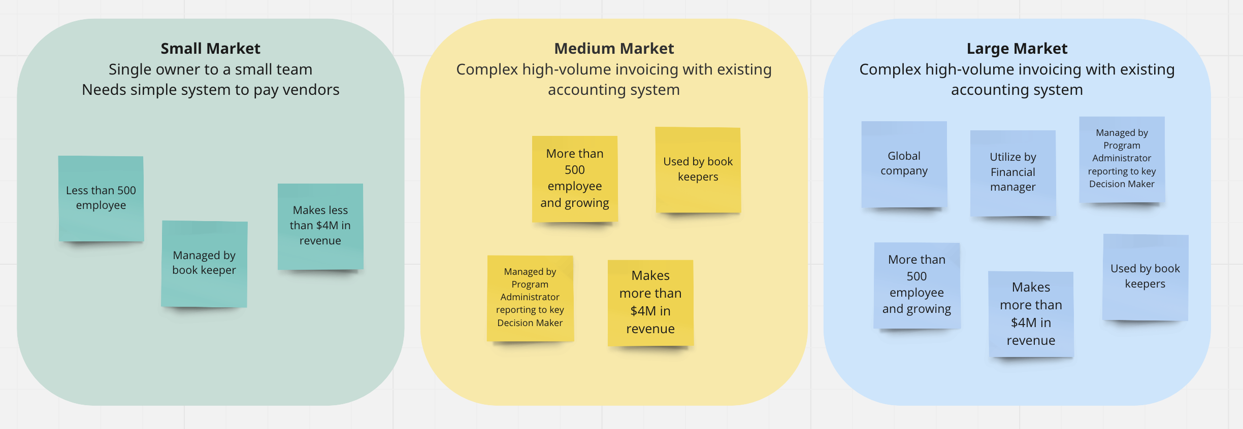
Business types and their needs
Users landing on the page have different business needs and are looking for different type of product
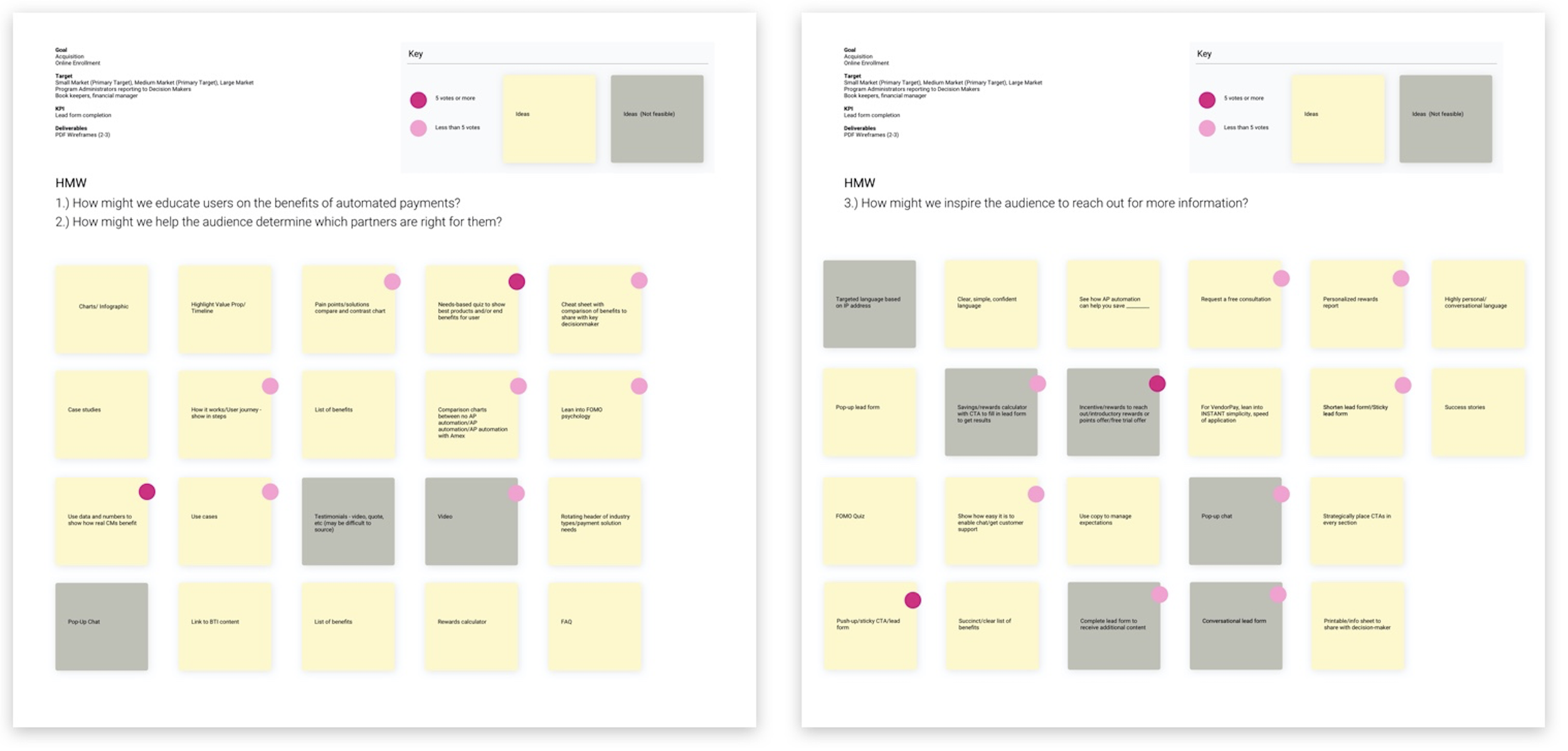
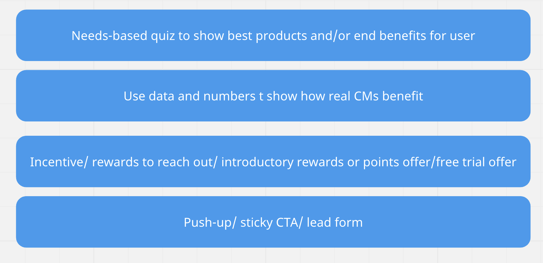
Ideation Workshop
The goal of this workshop is to share research, align on challenges, and brainstorm solutions
How might we educate users on the benefit of automated payments?
How might we help the audience determine which partners are right for them?
How might we inspire the audience to reach out for information?
Key Patterns
A focus group and interview were conducted to identify demographic and overlapping patters of current card holders and prospect customers
Content Hierarchy Testing
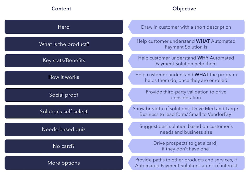
To create connection with users and reduce bounce rates, strategic placement of content on each page are considered.
Putting the most important information at the top of the page and the least important at the bottom. The content needs to answer questions users may have and direct them to the right destination.
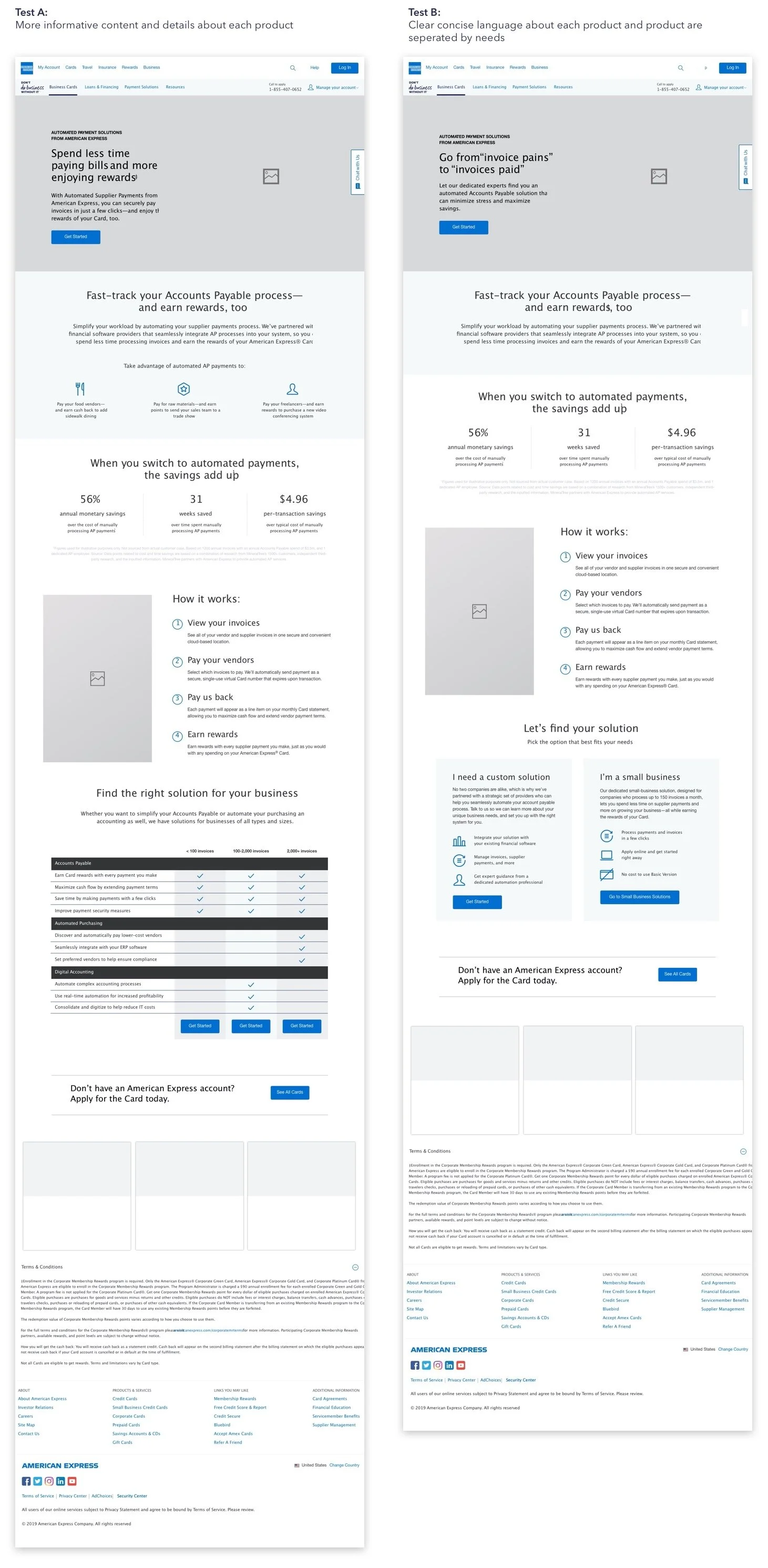
Wireframe Testing
Hypothesis
Users need more information on product in order to self-select
Usability Test Objective
A/B Testing is used to determind how much information prospect needs inorder to convert and to test what language users respond to for this product
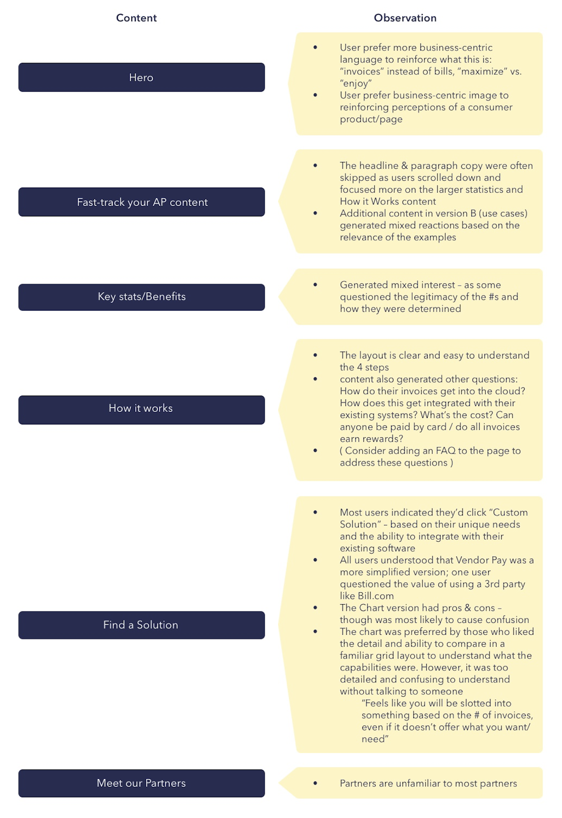
Test Findings
Test A was overwhelming for users landing on the page for the first time.
However, more informative content where helpful. Providing details based on needs, like in Test B, made it easier for users to quickly decide which product to proceed with
Insights
User needs landing page to cater to their individual journey
Each users are consuming information differently depending on what they are looking for. This page needs the flexibility to cater to all users landing on this page.
This page needs to help guide users to the right product for them through self-selection
Users need a mental model of what to expect after enrolling for the program
This gives feeling of ease and control to the user. Another benefit to help set user expectation and lower disatisfaction
Provide more informative resource
User can benifit from FAQ on this pager. It positions American Express as an expert in the fields and use the page as reference to valuable content for users
Final Design
Final Wireframe
Final UI
Results
200% increase in conversion
Measurements
User sign-up
Self select to the correct business size
Measured over 1 year
